Plotly
Plotly is an open-source graphing library that makes interactive, publication-quality graphs online. It supports numerous chart types and integrates seamlessly with Python, R, MATLAB, and more, enabling users to create and share complex data visualizations with ease.
About Plotly
Plotly stands out as a powerful and versatile data visualization library designed to empower users to create stunning, interactive charts and dashboards directly in their web browser or through popular programming languages. Its core strength lies in its ability to move beyond static images, providing dynamic visualizations that allow viewers to explore data in real-time.
Key capabilities include:
- Extensive Chart Types: Plotly supports a vast array of chart types, from basic line and bar charts to complex 3D plots, statistical graphs like box plots and histograms, and specialized visualizations like maps and financial charts. This breadth ensures users can find the perfect visual representation for almost any dataset.
- Interactivity Built-in: Unlike traditional charting libraries, Plotly's visualizations are inherently interactive. Users can zoom, pan, hover over points to see data details, and even toggle data traces on and off, facilitating deeper data exploration.
- Language Flexibility: Plotly offers APIs for popular programming languages including Python, R, MATLAB, and JavaScript, allowing developers and data scientists to integrate Plotly into their existing workflows and applications.
- Online Sharing and Collaboration: Plotly's platform facilitates easy sharing of visualizations online. Users can embed charts in websites, share links, and even collaborate on dashboard projects, making it ideal for presentations, reporting, and team data analysis.
- Web-Based Dashboarding: With tools like Dash, built on top of Plotly, users can create sophisticated web-based dashboards entirely in Python. This enables the creation of analytical applications without requiring front-end development expertise.
Plotly's commitment to open-source development ensures continuous improvement and a large, supportive community. Whether you are a data scientist, analyst, researcher, or developer, Plotly provides the tools to transform raw data into compelling and informative visual stories.
Pros & Cons
Pros
- Creates highly interactive and customizable charts.
- Supports multiple popular programming languages (Python, R, MATLAB, JavaScript).
- Extensive range of chart types available.
- Enables easy online sharing and embedding of visualizations.
- Frameworks like Dash allow for building analytical web applications.
Cons
- Steeper learning curve for advanced customization.
- Performance can be impacted with very large datasets.
- Documentation, while comprehensive, can be overwhelming at times.
What Makes Plotly Stand Out
High-Quality Interactive Visualizations
Create publication-quality graphics that are fully interactive, enhancing data exploration and understanding.
Multi-Language API Support
Offers robust APIs for Python, R, MATLAB, and JavaScript, integrating seamlessly into existing data science and development stacks.
Features & Capabilities
13 featuresExpert Review
Plotly Software Review
Plotly is a widely recognized and utilized software development kit for creating interactive, publication-quality graphs. Its strength lies in its ability to generate web-based visualizations using common programming languages. This review examines its key aspects, including its functionality, ease of use, performance, and suitability for various applications.
Functionality and Features
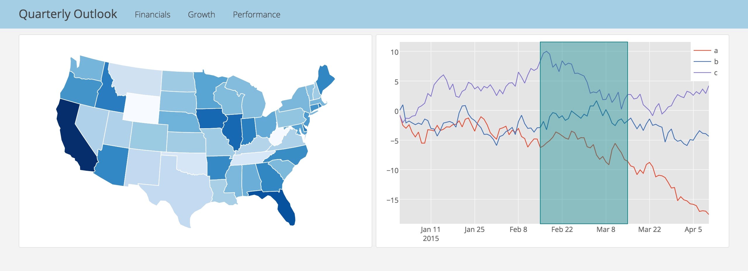
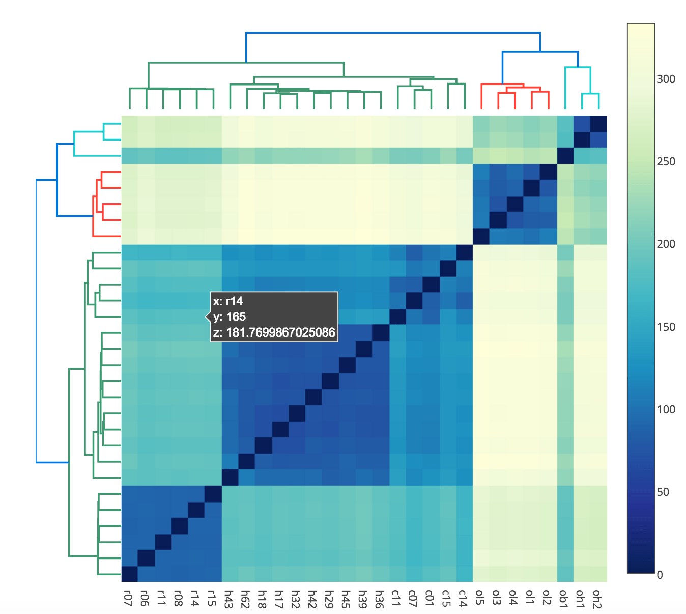
Plotly excels in the breadth of its charting capabilities. It supports a comprehensive range of chart types, from fundamental plots like scatter and line charts to more specialized visualizations such as dendrograms, heatmaps, and 3D plots. The level of customization available for each chart type is extensive, allowing users fine-grained control over appearance, labels, and interactive elements. The built-in interactivity, including zooming, panning, and hovering, is a significant advantage, enabling deeper data exploration directly within the visualization.
The library's support for multiple programming languages is a major plus. Its APIs for Python, R, and MATLAB are particularly popular within the data science community, allowing users to integrate Plotly visualizations into data cleaning, analysis, and modeling workflows seamlessly. The JavaScript library provides flexibility for web development. The integration with tools like Dash for building analytical web applications without extensive front-end coding is a powerful feature for deploying interactive dashboards.
Ease of Use
The ease of use can vary depending on the user's familiarity with the programming language being used. For those comfortable with Python or R, generating standard charts is relatively straightforward with well-documented functions and examples. Creating highly customized or complex visualizations can require a deeper understanding of Plotly's object model and layout options. The online documentation is comprehensive and generally helpful, although navigating the vast array of options can sometimes be challenging for new users. Community support through forums and online resources is generally good.
Performance
Plotly visualizations are rendered using web technologies (SVG or WebGL for 3D plots), which generally results in good performance, especially for datasets of moderate size. For very large datasets, performance can degrade, and strategies like data aggregation or downsampling may be necessary. The interactivity remains smooth for reasonable data volumes. Server-side rendering can be employed for some scenarios to improve performance with very large datasets.
Applications
Plotly is well-suited for a wide range of applications, including:
- Data Science and Analytics: Creating exploratory data visualizations, presenting findings to stakeholders, and building interactive dashboards.
- Research and Academia: Generating high-quality plots for publications and presentations.
- Web Development: Embedding interactive charts in web applications.
- Business Intelligence: Building custom dashboards for monitoring key performance indicators.
- Education: Illustrating concepts in statistics, mathematics, and data analysis.
Comparison
Compared to static plotting libraries, Plotly's built-in interactivity offers a significant advantage. When compared to other interactive web charting libraries, Plotly's broad language support and the capabilities offered by frameworks like Dash make it a compelling choice, particularly for users already working within the Python or R ecosystems.
Conclusion
Plotly is a robust and versatile tool for creating interactive data visualizations. Its extensive chart types, multi-language support, and built-in interactivity make it a valuable asset for data scientists, analysts, and developers. While there can be a learning curve for advanced customization, the comprehensive documentation and community support help mitigate this. For users seeking to move beyond static plots and create engaging data narratives, Plotly is a highly recommended solution.
Screenshots